- Church Management Reporting
Dashboard Overview
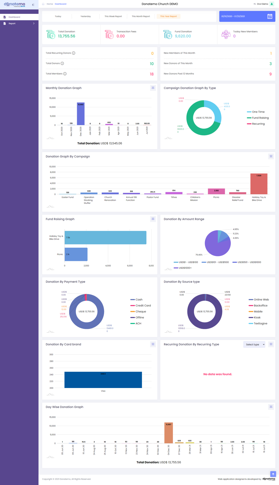
Duration filters
- On the load reporting dashboard, by default “This Month Report” filter applies.
- All graphs and counts are loaded as per the default filter apply.
- As you can see from the above screenshot, on top of the header of the reporting dashboard there are some filters like “Today”, “Yesterday”, “This Week Report”, “This Month Report”, “This Year Report” and “Date-range picker”.
- After applying these above filters, the dashboard refreshes according to the filters, and the date range will be set as per which filter is applied.
- When applying a custom date-range filter, the dashboard gets reloaded as per the date-range filter applies.
Donations filters
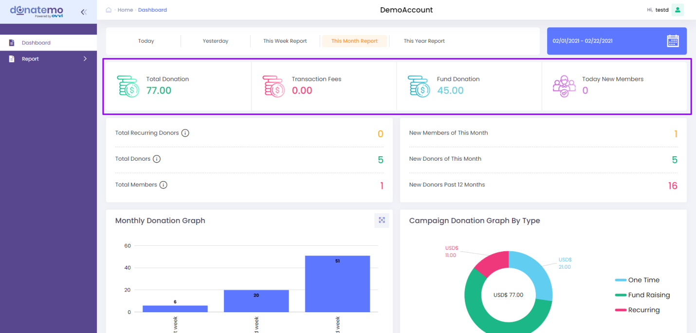
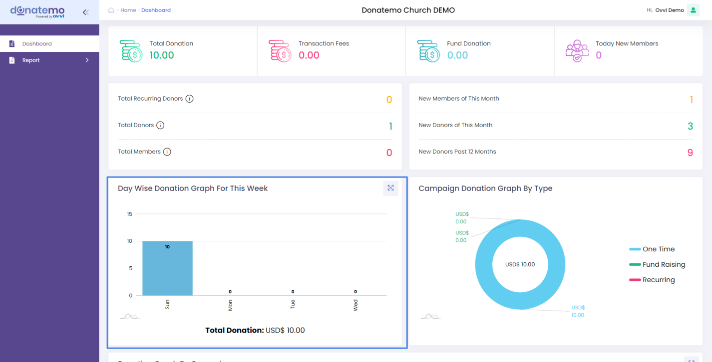
- As you can see from the above screenshot there is a display of some counts related to donations like “Total Donation”, “Transaction Fees”, “Fund Donation”, “Today New Members”.
- “Total Donation”: It displays total donation including with one time, fundraising, recurring, and all campaigns donation.
- “Transaction Fees”: It displays the total transaction fees of the donation.
- “Fund Donation”: It displays the total fundraising donation of the “fundraising campaign” only.
- “Today New Members”: It displays counts of today’s new registered members.
Member filters
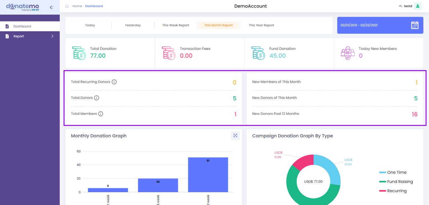
- As you can see from the above screenshot it has a display of some counts related to donors and members like “Total Recurring Donors”, “Total Donors”, “Total Members”, “New Members of This Month”, “New Donors of This Month”, “New Donors Past 12 Months”.
- “Total Recurring Donors”: It Displays the total recurring donors, means in which members have a recurring donation.
- “Total Donors”: It displays the count of all members who had done donation like one time, fundraising, recurring donation.
- “Total Members”: This is displayed as the total count of members for this organization.
- “New Members of This Month”: This is displayed as the total count of members who has registered for this month only.
- “New Donors of This Month”: This is displayed as the total count of members who has registered and made donations for this month only.
- “New Donors Past 12 Months”: This is displayed as the total count of members who has registered and made donations in these past 12 months only.
- From the above explanation, all donation counts, members count and donors counts are changed as per the above filters.
Month,Day,Week Wise Donation Graph
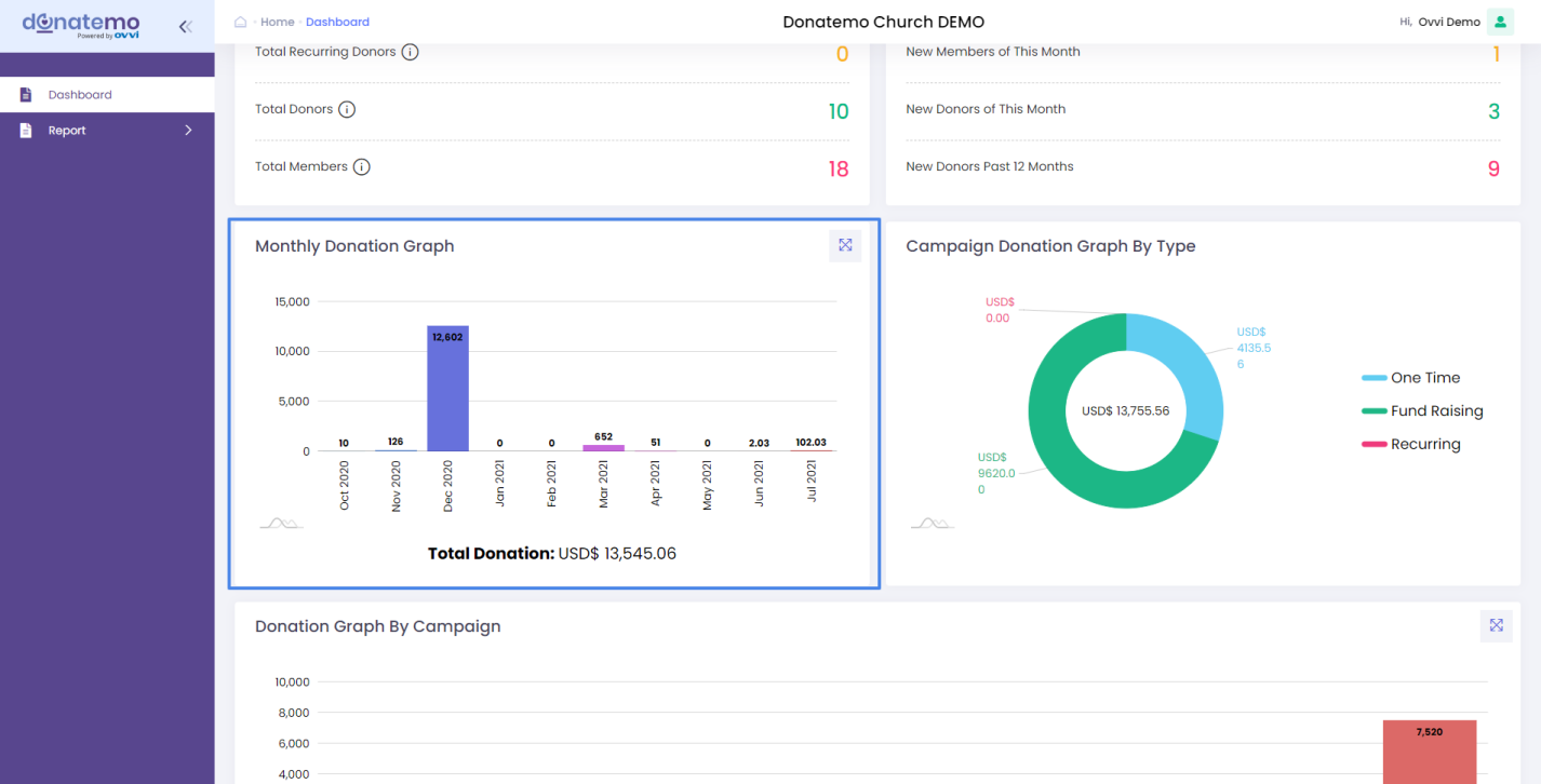
- As you can see from the above screenshot, this is the monthly donation graph in bar chart graphical form.
- The monthly donation graph is displayed in two coordinates X and Y.
- X coordinate depends on the duration, the duration depends on which filter was applied. Below we had explained in detail.
- Y coordinate displayed donation in amounts like 100, 200, etc…
- X coordinates (Duration): On default load of the reporting dashboard “This Month” filter is applied, so on the X coordinates it is displayed as “1st Week”, “2nd Week”, ”3rd Week”, etc….
- If “This Year” filter is applied, so on the X coordinates it is displayed as month-wise like “Jan 2021”, “Feb 2021”, etc…
- If “This Week” filter is applied, so on the X coordinates it is displayed as week-wise like “Sunday”, “Monday”, “Tuesday”,etc…..
- The same will reflect in “Yesterday”and “today” filter in the X coordinates.
- Graph loading depends on which filter was applied, and shows the graphical data as we have explained above.
- The monthly donation graph shows the data of any campaign donation & any member’s donation, but it depends on time duration.
- For example: If “This Year” filter was applied then the graph will show the “Jan 2021”, “Feb 2021” to current month columns and returns of each month’s total donation.
- As you can see from the monthly donation graph, in that panel you can see on the top right corner there is one icon displayed. When you click on that icon, the graph opens a popup with additional features like zoom, scroll, and details reporting, etc…
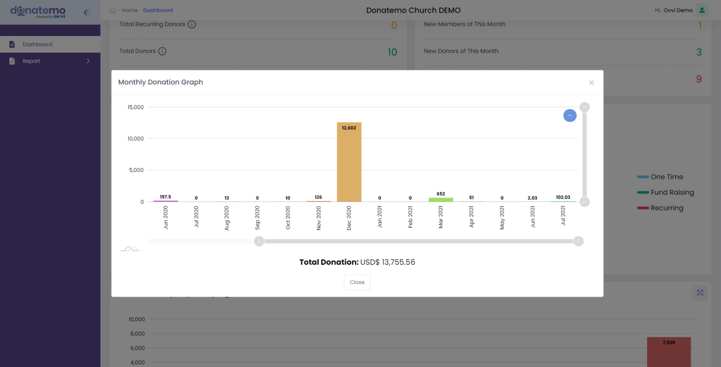
- As you can see in the above screenshot there is a monthly donation popup graph, that is displayed after clicking on the icon.
- On this popup graph, you can zoom in and scroll the graph.
- When you click on the bar of the popup graphs, It will get redirect and will filter with details reporting for this monthly donation graph.
Campaign Donation Graph By Type
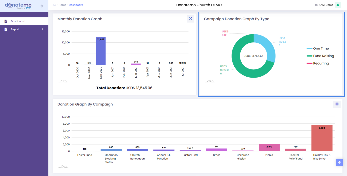
- As you can see from the above screenshot, this is a campaign donation graph by donation type.
- This graph is displayed as a donut graph and represents the campaign type-wise total donation amount.
- For campaign types like “One time”, “Fund Raising”, and ”Recurring”.
- On hover of the donut slice, it will show the effect and will display the total donation amount on the slice.
- After clicking on the donut slice, it will redirect to the detailing report for the campaign donation graph.
Donation Graph By Campaign
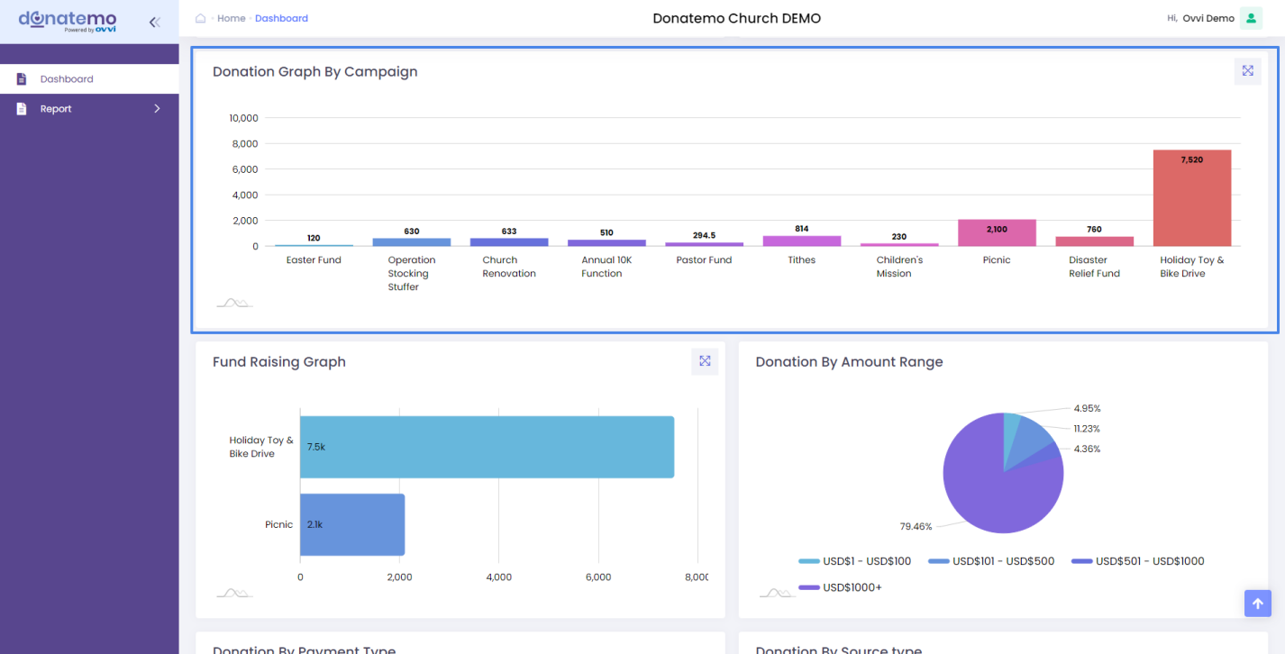
- As you can see from the above screenshot, this is a donation graph by the campaign.
- This graph is displayed as a bar graph and represented all the campaign total donation amounts.
- This graph has two coordinates, X coordinates represent the campaign title and Y coordinates represent the donation amount.
- For the dashboard, there is a limit of campaigns displayed but on the popup graph, it will display all campaign donations with scroll and zoom-in features.
- Popup of graph loads when you click on the upper right corner icon which displays on the above screenshot.
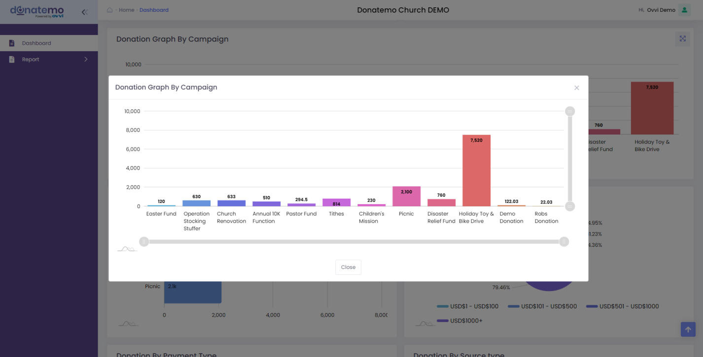
- On this popup graph, you can zoom in and scroll the graph.
- When you click on the bar of the campaign popup graph, It will redirect and filter with details reporting for this donation graph by the campaign.
Fund Raising Graph
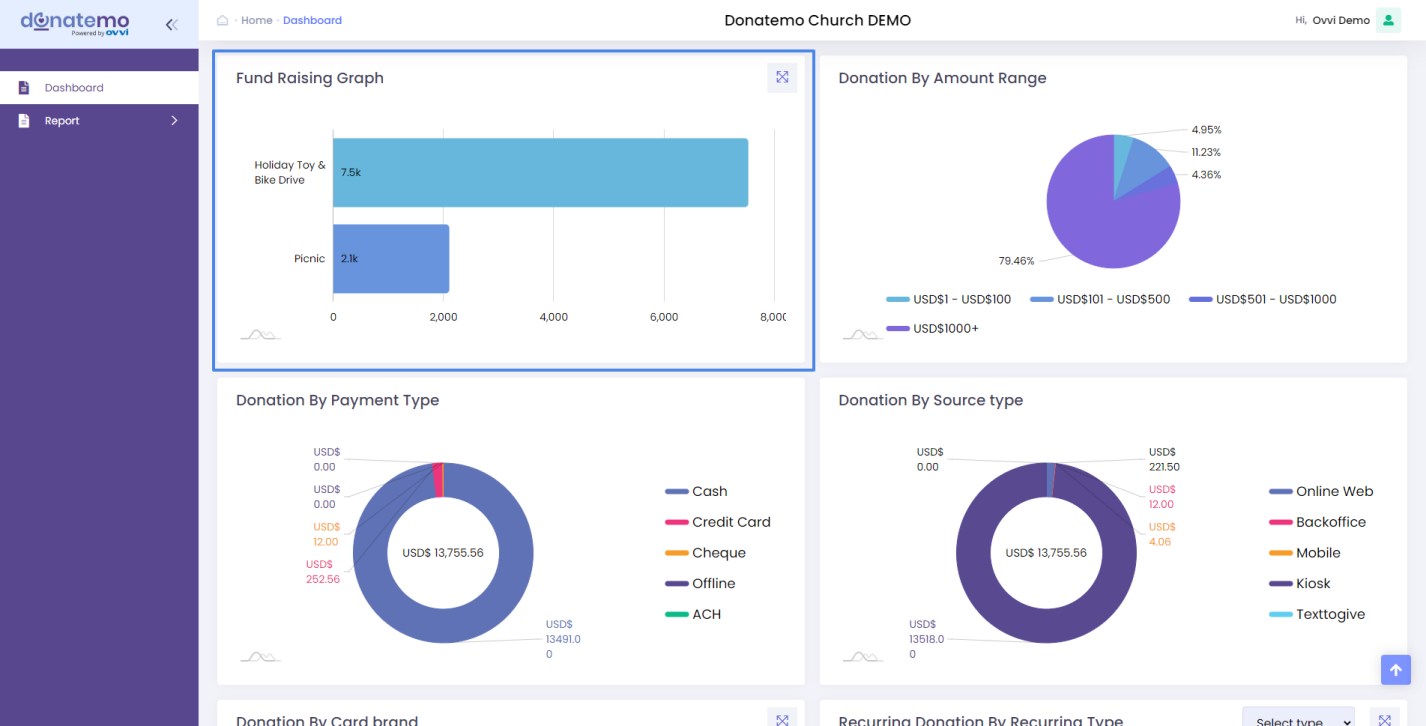
- As you can see in the above screenshot, this is a fundraising graph.
- This graph is displayed as a line graph and represents the total fund campaign donation graph.
- This graph has two coordinates, X coordinates represent the fundraising campaign title and Y coordinates represent the donation amount.
- For the dashboard, there are limits of fundraising campaigns, but it will be displayed on the popup graph & it will display all fundraising campaign donations with scroll and zoom-in features.
- Popup of graph loads when you click on the upper right corner icon which displays on the above screenshot.
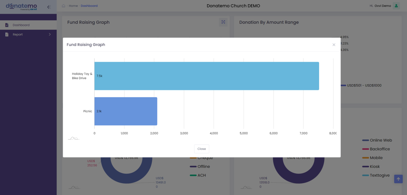
- On this popup graph, you can zoom in and scroll the graph.
- When you click on the bar of the fundraising campaign popup graphs, It will redirect and filter with details reporting for this donation graph by the campaign.
Donation By Amount Range
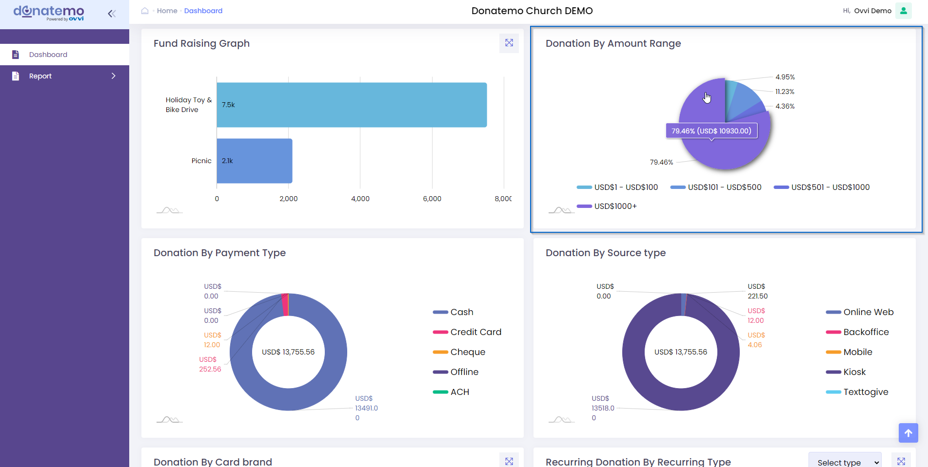
- As you can see in the above screenshot, this is a donation by amount range graph.
- This graph is displayed as a pie chartand represents the donation amount range with maximum and minimum donation amount range.
- On this graph we can got the how much donation with % on specific range.
- On hover of pie slice, there are donation information displayed for specific range.
- On this popup graph, you can zoom in and scroll the graph.
- When you click on the bar of the recurring campaign popup graphs, It will redirect and filter with details reporting for this donation graph by the campaign.
Donation By Payment Type
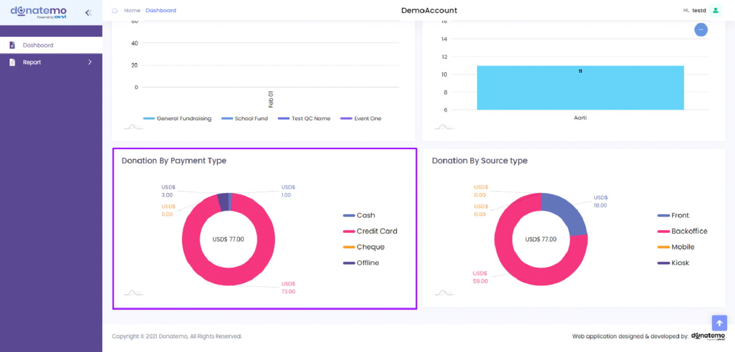
- As you can see in the above screenshot, this is a donation graph by payment type.
- This graph is displayed as a doughnut graph and represented the total donation graph by donation payment type of all campaigns.
- There are a total of four donation types like “Cash”, “Credit Card”, “Cheque”, “Offline”.
- For cash donation, the doughnut slice represents a total cash donation of all campaigns.
- For credit card donation, the cc donation doughnut slice represents the total credit card donation of all campaigns.
- For cheque donation, there is only a total if the donation has a cheque of all campaigns.
- For Offline, there is a display of the total donation which is the only donation that is offline.
- On the hover of the doughnut slice, it will show the hover effect and displays the total donation amount on the slice.
- After clicking on the doughnut slice, it will redirect to the detailing report for the donation by payment graph.
Donation By Source Type
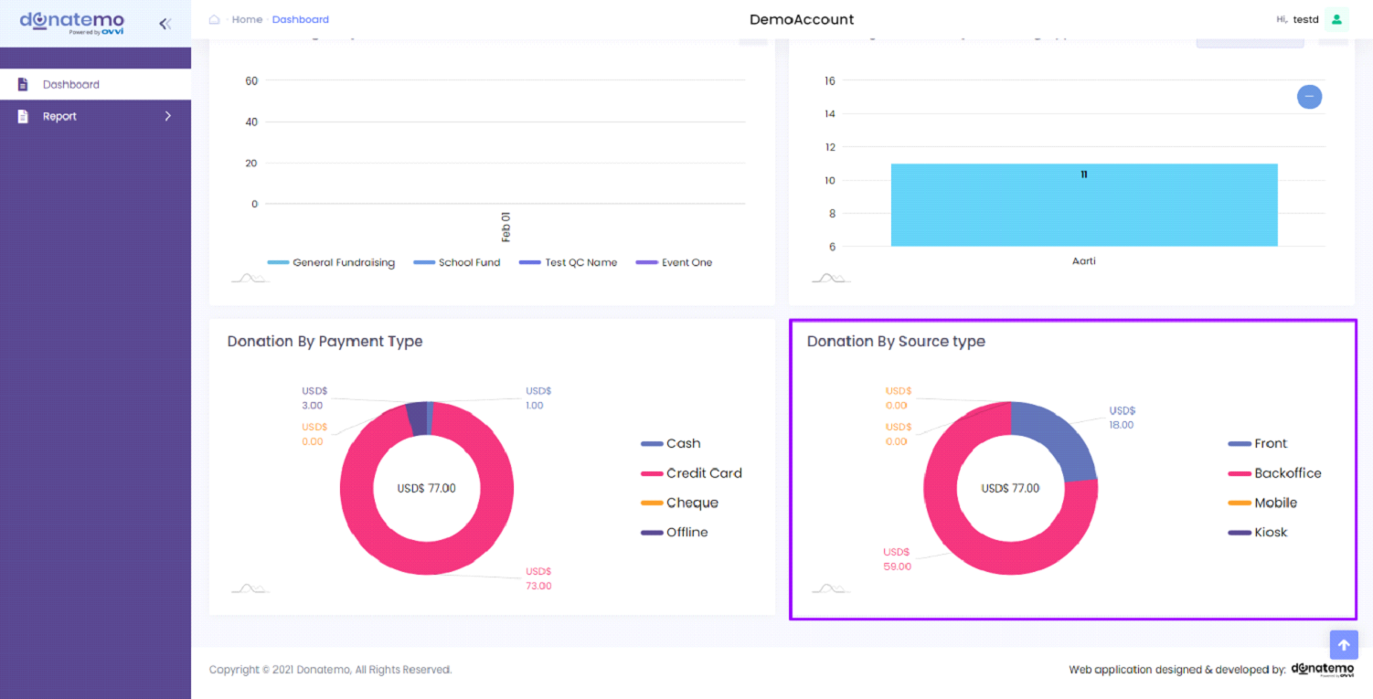
- As you can see in the above screenshot, this is a donation graph by source type.
- This graph is displayed as a doughnut graph and represents the total donation graph by source type of all campaigns.
- There are a total of four donation types like “Front”, “Backoffice”, “Mobile”, “Kiosk”.
- For the front donation, the doughnut slice represents a total donation from the front donation URL of all campaigns.
- For back-office donation, the donation doughnut slice represents the total donation from the back office of all campaigns.
- For mobile donation, there is only a total of the donation from mobile devices only of all campaigns.
- For kiosk donation, there is a display of the total donation which is the only donation from the kiosk device.
- On the hover of the doughnut slice, it will show the hover effect and displays the total donation amount on the slice.
- After clicking on the doughnut slice, it will redirect to the detailing report for the donation by source type graph.
Donation By Card Brand
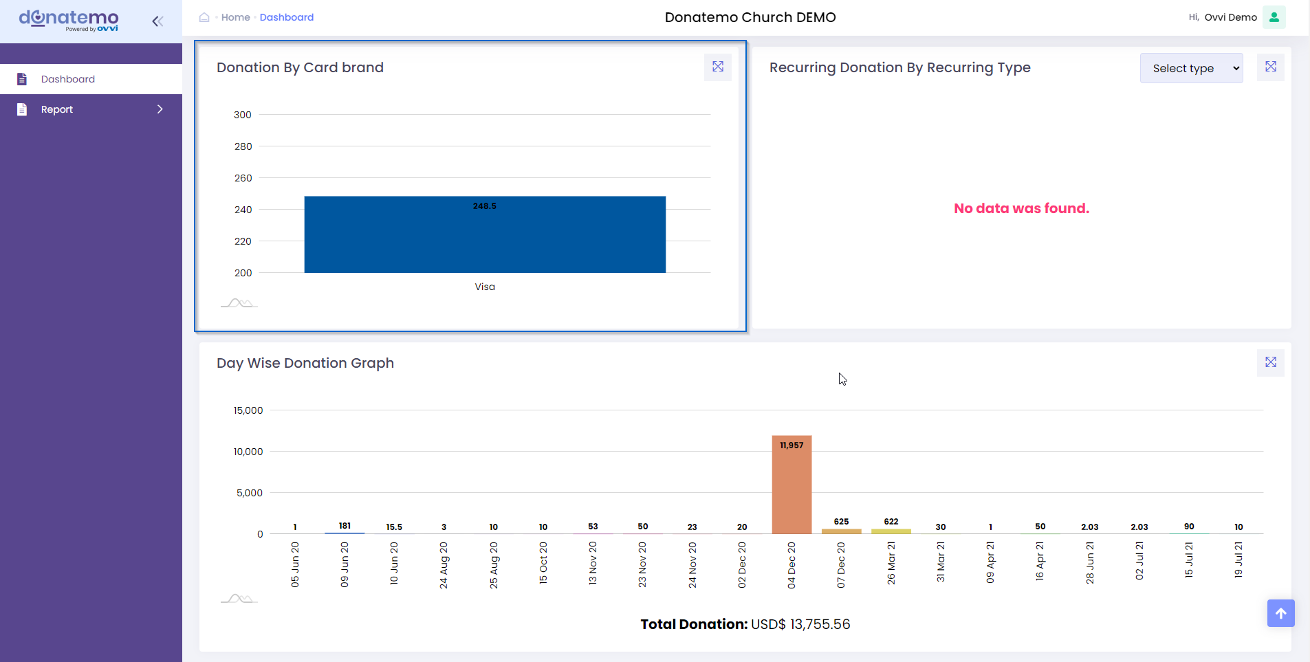
- As you can see in the above screenshot, this is a donation graph by card brand.
- This graph is displayed as a bar graph and represents the total donation by card brand types.
- There are card brandtypes like “Visa”, “Master card”, “Discover”, “Amex”.
- On the hover of the bar slice, it will show the hover effect and displays the total donation amount on the slice.
- After clicking on the bar slice, it will redirect to the detailing report for the donation by card brand.
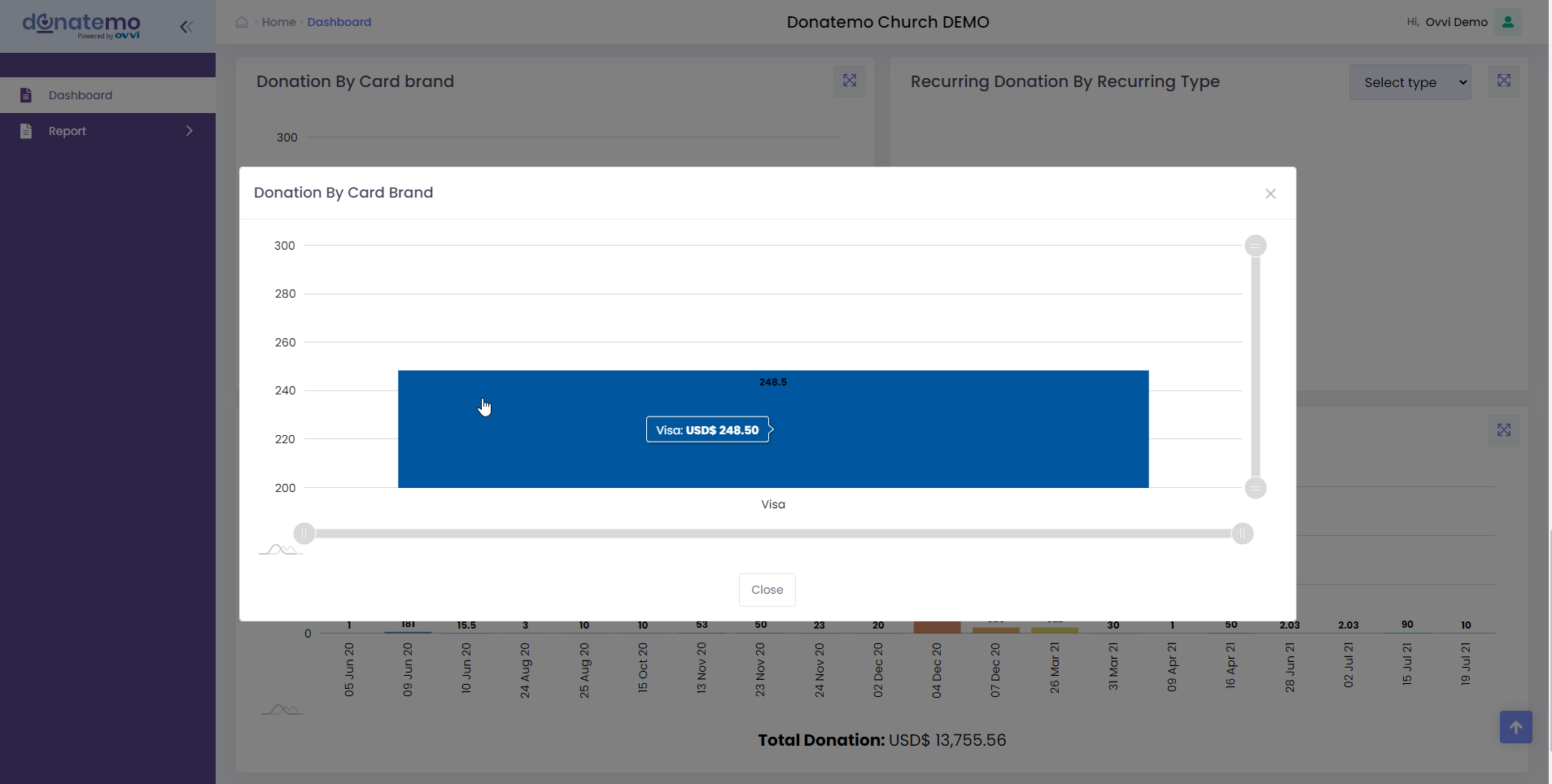
- Popup of graph loads when you click on the upper right corner icon which displays on the above screenshot.
- On this popup graph, you can zoom in and scroll the graph.
- When you click on the bar of the card brand popup graphs, It will redirect and filter with details reporting for this donation by the card brand.
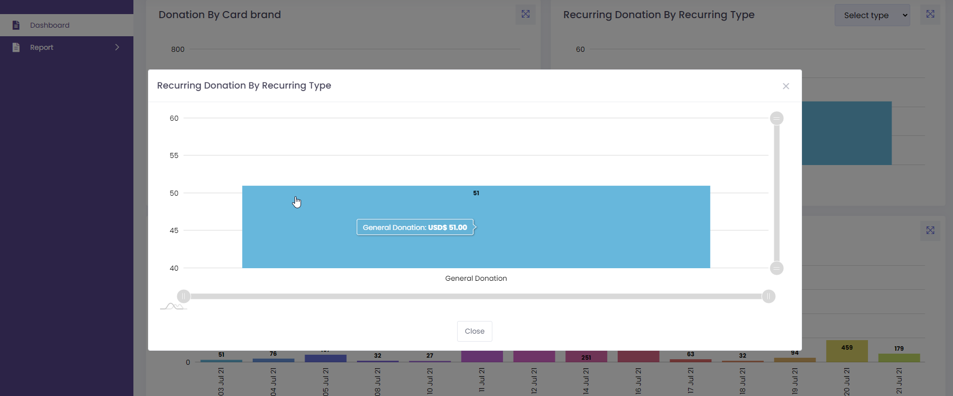
Recurring Donation By Recurring Type
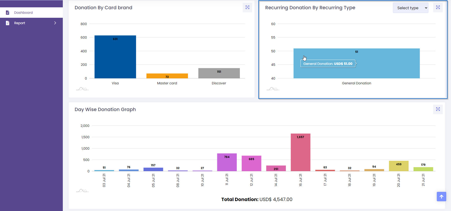
- As you can see in the above screenshot, this is a recurring donation graph by recurring type.
- This graph is displayed as a bar graph and represents the total recurring donation graph by recurring type of all campaigns.
- This graph has two coordinates, X coordinates represent the recurring campaign title and Y coordinates represent the donation amount.
- There are a total of four recurring types like “Daily”, “Weekly”, “Monthly”, “Yearly”.
- The daily recurring type represents a total daily recurring donation which is set by members.
- The weekly recurring type represents the week-wise recurring donation which sets the weekly and particular day of the week by members.
- The monthly recurring type represents the month-wise recurring donation which sets the monthly and particular day of the month by members.
- The yearly recurring donation type represents the year-wise recurring donation which sets the yearly and particular day of the year by members.
- For the dashboard there are limits of recurring campaigns are displayed. But on the popup graph, it will display all recurring campaign donations with scroll and zoom-in features.
- Popup of graph loads when you click on the upper right corner icon which displays on the above screenshot.
Day Wise Donation Graph
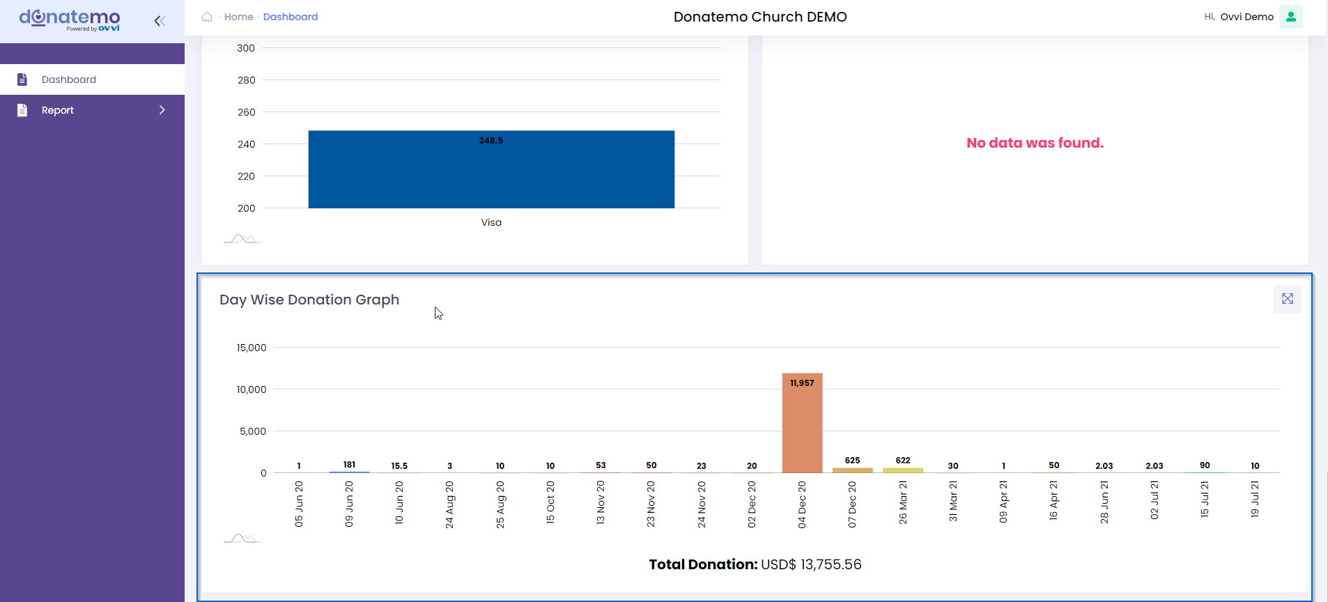
- As you can see in the above screenshot, this is aday wise donation graph.
- This graph is displayed as a bar graph and represents the total donation by day wise.
- On the hover of the bar slice, it will show the hover effect and displays the total donation for particular day.
- After clicking on the bar slice, it will redirect to the detailing report for the donation by particular day.
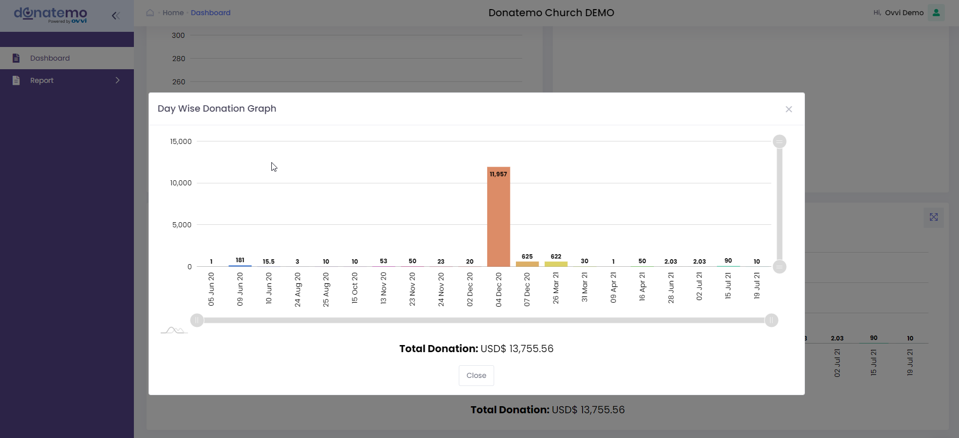
- Popup of graph loads when you click on the upper right corner icon which displays on the above screenshot.
- On this popup graph, you can zoom in and scroll the graph.
- When you click on the bar of the day wise popup graphs, It will redirect and filter with details reporting for this day wise donation graph.